Production Blog

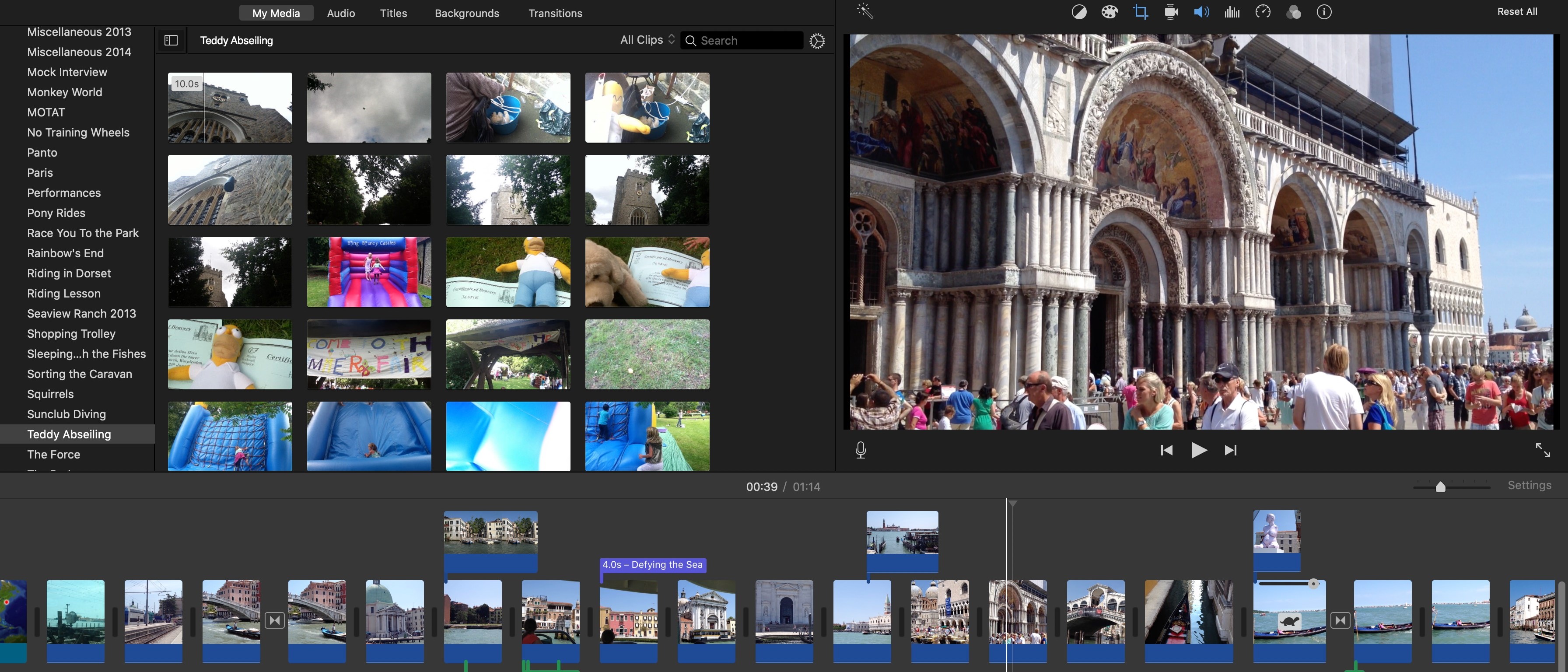
I was finally beginning to insert the titles into the film. This would make it an officially opening title sequence to my film. I previously did all my research on what to do. It's a pretty easy process. I used the editing software called Imovies. It works well, especially when paired with an apple device. I uploaded my complete film into the software. This was after I did the editing for the colors and speed. I then had to go over all the names and titles I needed to add. I then need to go over whether I still wanted to go over my original plan for the fonts. I also needed to go over whether I like the amount of time the titles stayed on the screen. I decided to still go with it. I began to edit almost exactly what I stated earlier, however the opening credits will appear in two fonts: Rockwell Italic and Rockwell Bold Italic. I have placed the titles, and they will pop into the corner of the screen. The movie's name being in the middle and center. The rest of the titles will be the ones in the corners. I still decided to not be extra and just emended them in the setting presented. However, I decided not to have them on a black screen where the fonts are white. The movie title is the only title in all caps where its the only one in Rockwell Bold Italic. The rest of the titles have the first letter of the first word and of people's first and last name capitalized, while the rest are in lowercase. These titles are presented in the Rockwell Italic font. The title's name is edited to come together and will fade in and fade out. Titles will disappear after 2 or 3 seconds max.
Comments
Post a Comment